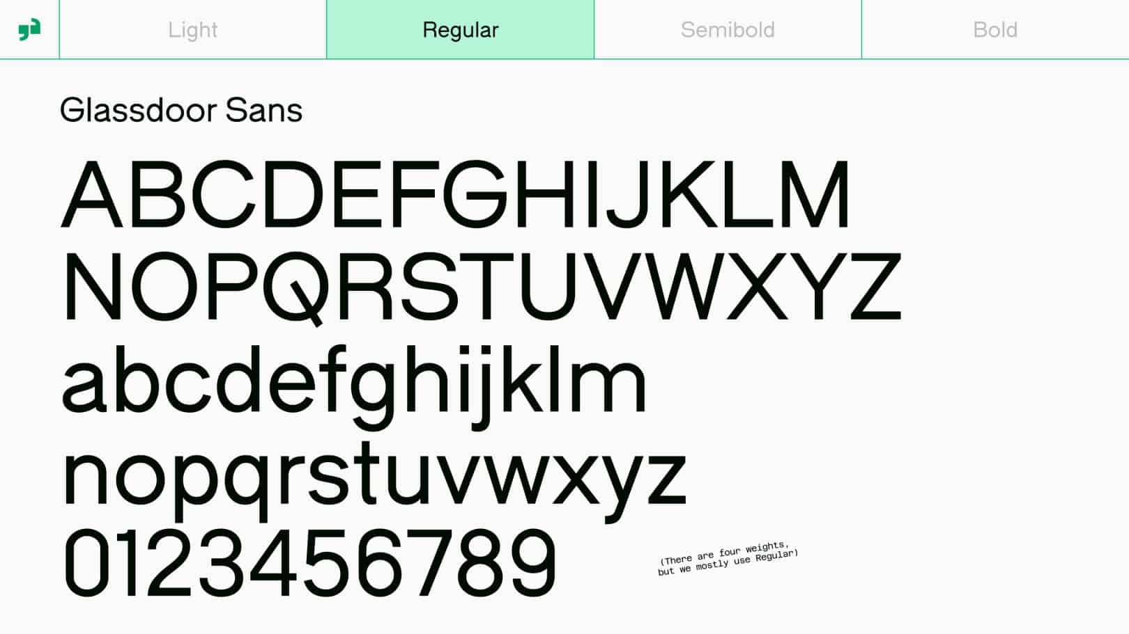
How we delivered a charming custom sans-serif that defines the new era of Glassdoor.
Known globally as the leading site for honest workplace insights, Glassdoor has undergone its first-ever major visual and verbal rebrand. Opting for a more holistic approach — one where they can foster authentic discussions on important subjects such as equal pay, workplace diversity and life beyond work — they reached out to KOTO to help communicate this with an inviting and friendly new brand direction.
Visual Identity: KOTO Illustrations: Josep Puy Typeface Design: Giulia Boggio Font Production / Direction: TYPE01
KOTO wanted to introduce a new typographic system, led by a customised typeface. Collaborating with KOTO’s LA studio, we teamed up with London-based type designer Giulia Boggio to produce a bespoke modification of their charming grotesque sans-serif Fabio XM.
This involved the creation of customised glyphs, contextual character sets and four additional font weights for both display and text purposes.
Importantly, this includes a fresh and gutsy uppercase treatment for the brand’s new wordmark, brought to life with a door-swing animation — reflective of the company’s name.
Paired with charming illustrations by Josep Puy, and a vibrant new colour palette, Glassdoor Sans is the perfect typeface to amplify Glassdoor’s commitment to creating a healthier, happier, and more transparent workplace community.
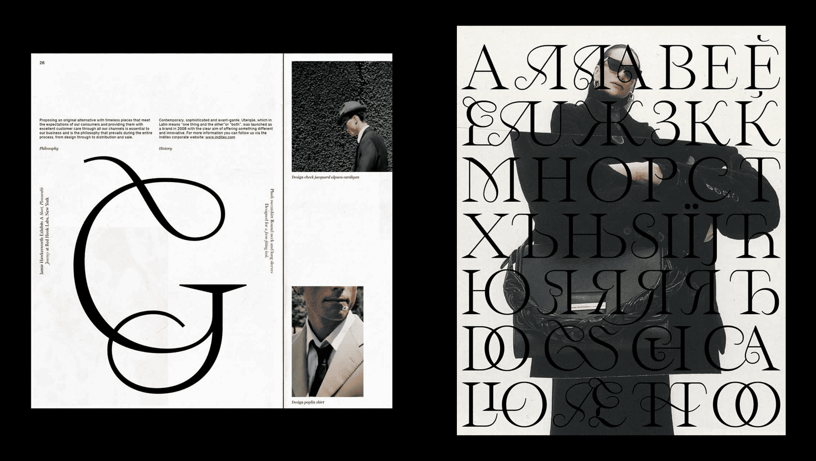
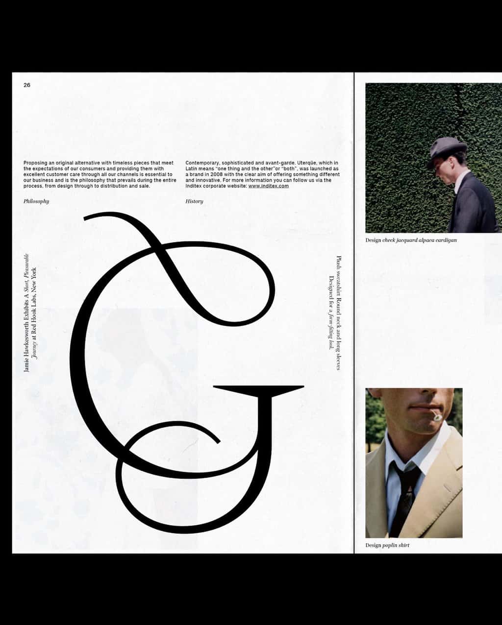
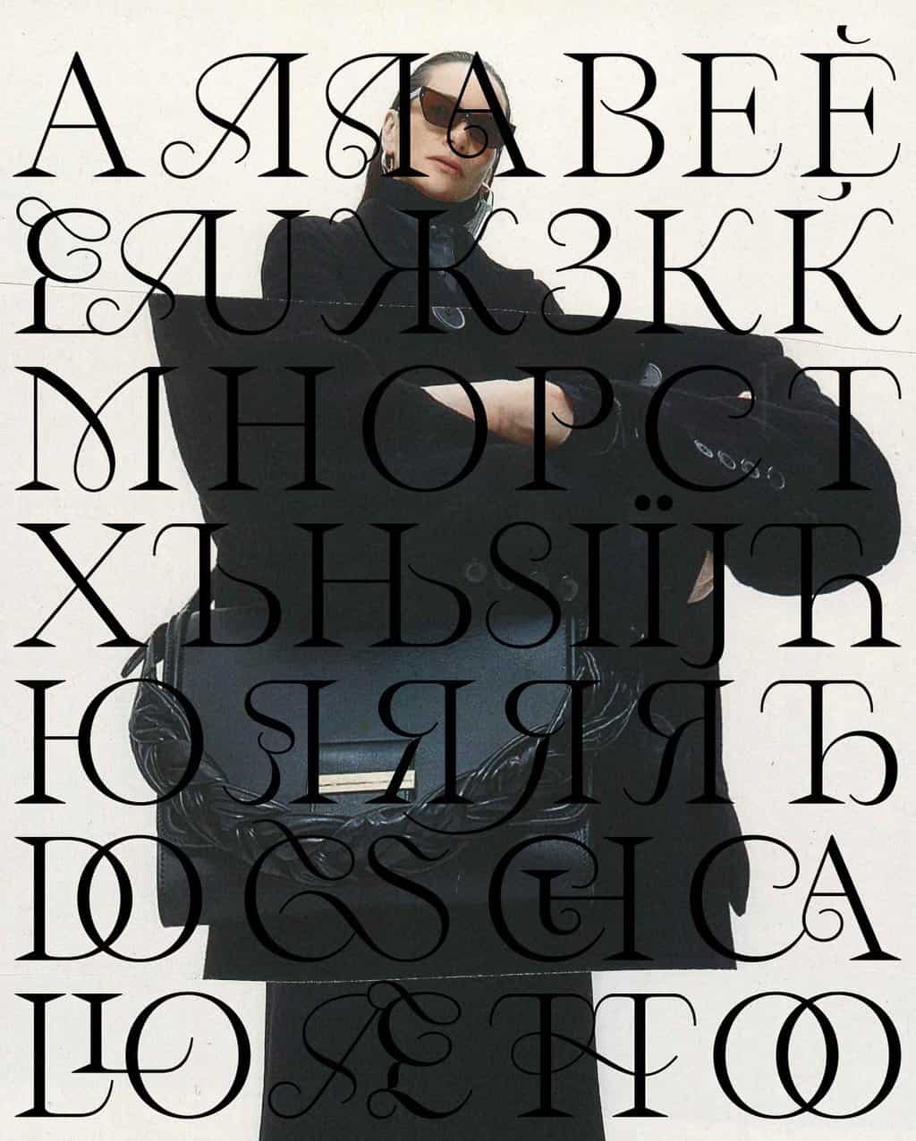
Working with Emma Marichal and Bouk Ra, we produced Cyrillic language support for Spanish multinational clothing giant Inditex.
Taking its name from the oldest of the garden roses, Rosa Gallica, Gallique is a typeface of dualities. Designed by French-type designer Emma Marichal, the contemporary serif blends the ‘soft petals’ of a rose with sharp, extended thorns.
Meanwhile, Hanol (a Korean word for a strand/thread or hair) is an elegant typeface by Bouk Ra that emphasises the beauty of curves within the strands of letters. Reminiscent of calligraphy, the varying stroke widths of Hanol result in beautifully decorative curves and ligatures.
Owner of several major brands such as: Zara, Bershka, and Pull&Bear, Inditex is a fashion powerhouse — the biggest fast fashion group in the world, in fact! Eager to utilise Gallique and Hanol in one of their brand applications, Inditex got in touch with us, asking us to create Cyrillic versions of both of these typefaces. So, working with Marichal and Ra, we produced customised font files that would be able to cover Bulgarian, Russian, Serbian, and Ukrainian language usage. Gallique retains its beautiful curves, ligatures, and razor-sharp points and includes more than 160 new glyphs, with alternates specifically for Bulgarian. Likewise, Ra embeds Hanol’s Cyrillic version with the same luxuriously flowing ligatures of the Latin version, also including Bulgarian-specific glyphs.
Typeface Design: Emma Marichal and Bouk Ra Font Production: TYPE01 / Type Department
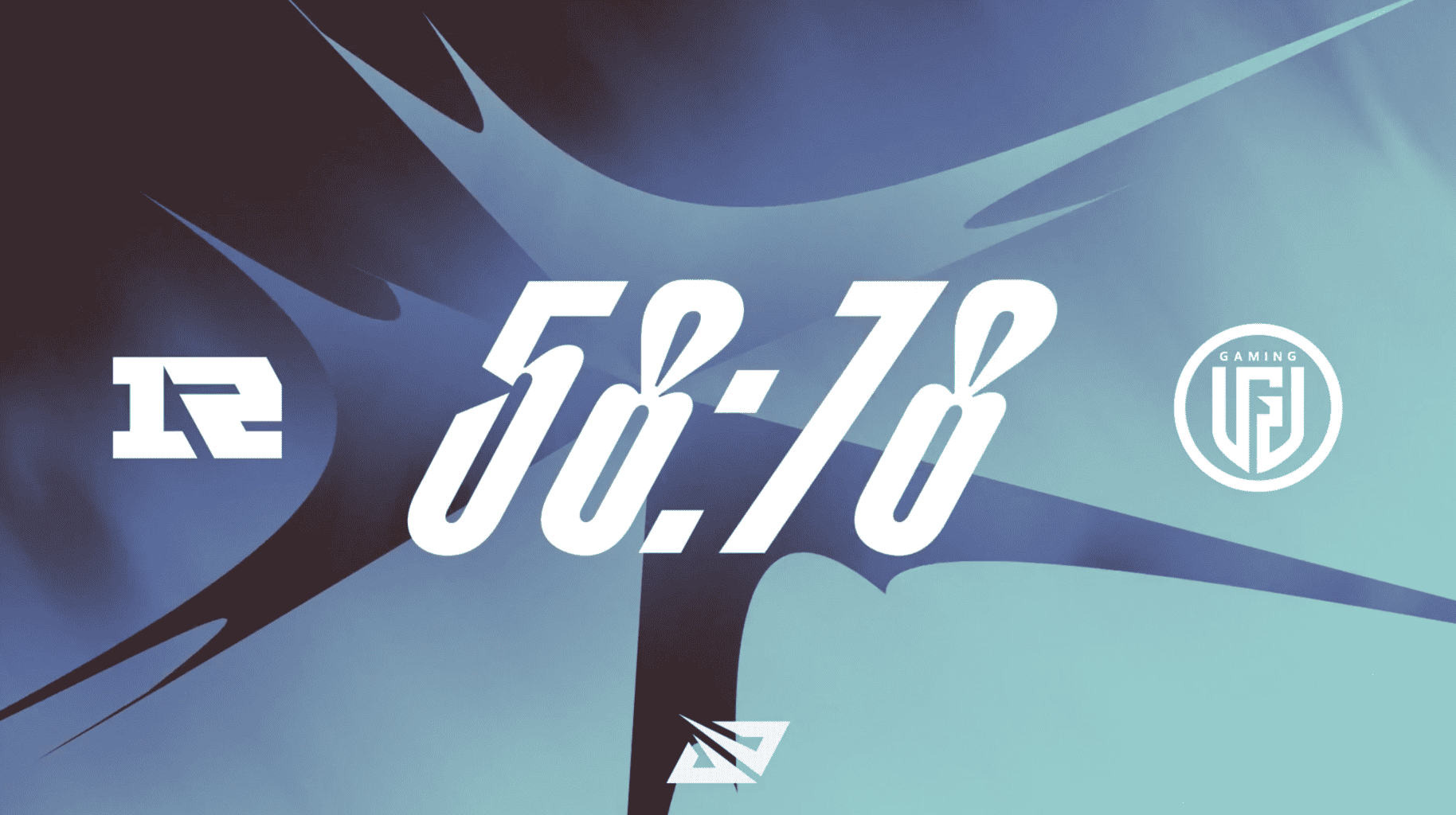
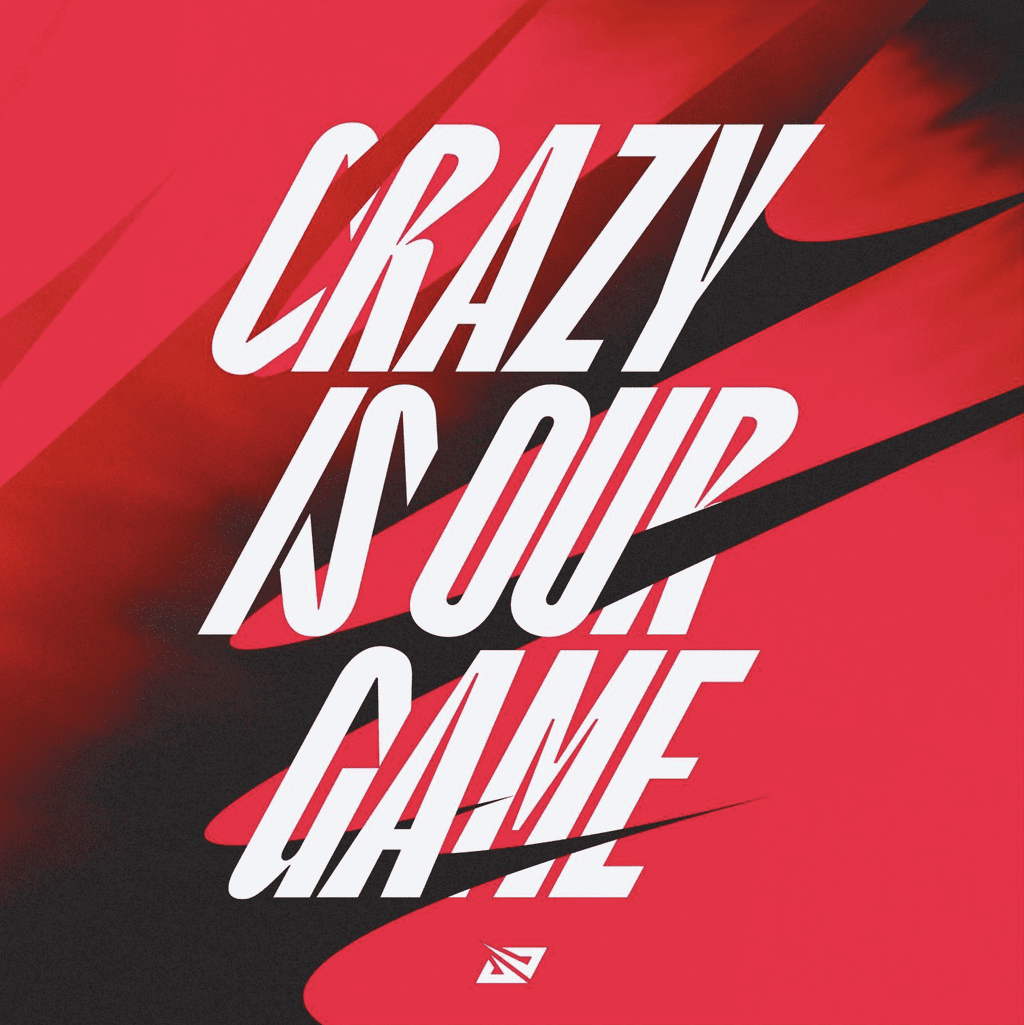
Striking, dynamic, and full of energy – TYPE01 produces a customised typeface that skillfully represents the Chinese League of Legends Pro League.
Chinese League of Legends Pro League (LPL) is the country’s leading top-level professional league for the global e-sport, housing 17 teams.
With an innovative and explosive style of play, the league has its sights on becoming the best esports league in the world. As such, it was time that LPL’s visual image accurately represented their signature tenacity, whilst also appealing to international fans. Looking for a powerful brand refresh, they approached the global branding agency DesignStudio.
In turn, the London-based team devised a design system stemming from two key behaviours — Tension and Eruption — alongside a new slogan: ‘Crazy is Our Game.’ The visual system and brand assets unify calm sophistication with moments of hyper-energy and volume.
Visual Identity: DesignStudio Typeface Design: Valerio Monopoli Font Production: T1 Foundry / Type Department
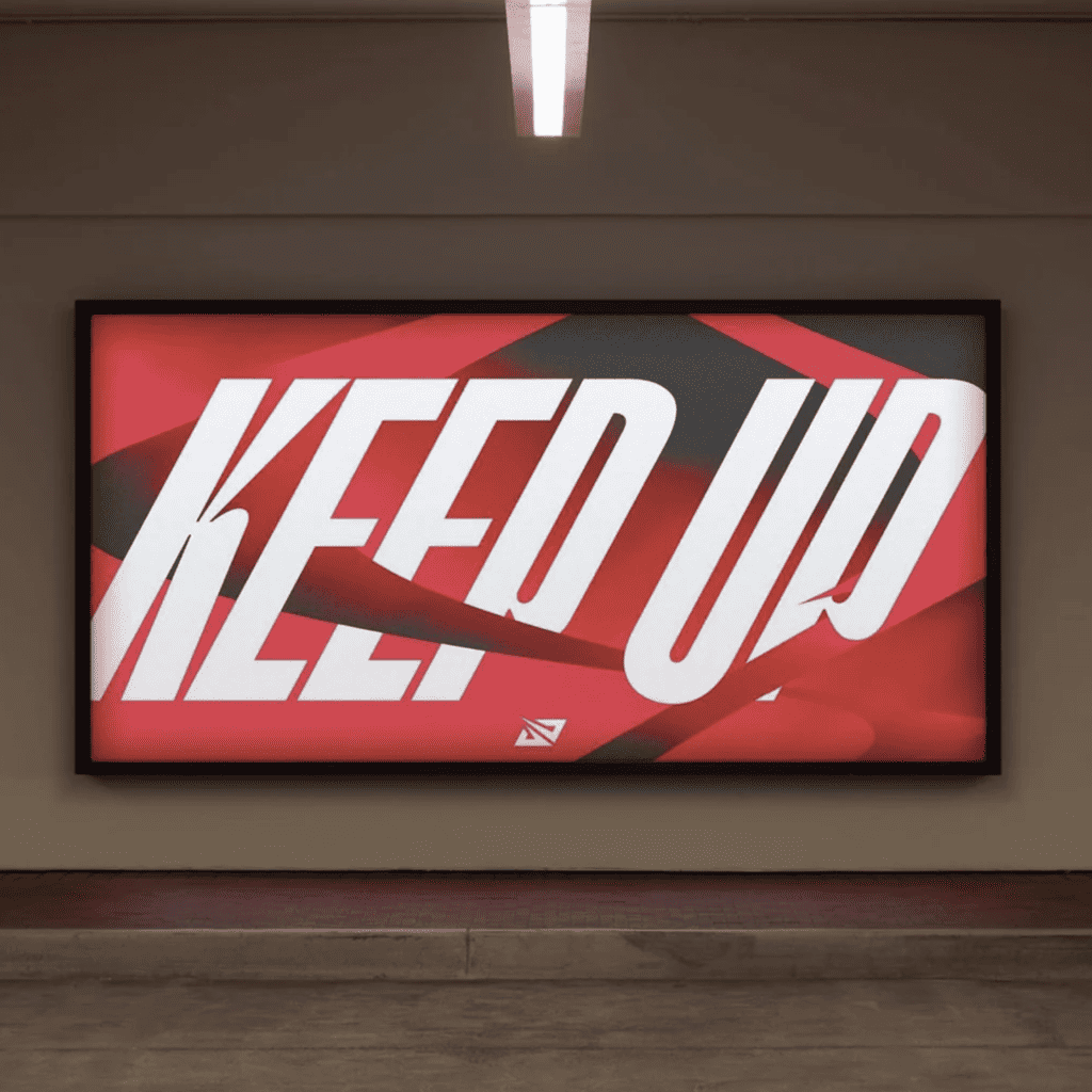
As part of this new dynamic visual language, DesignStudio reached out to us to aid in developing a customised typeface — one that would embody the energy and expression of the team. Working closely with DS’ design team and type designer Valerio Monopoli, we produced an altered version of T1 Foundry’s striking display sans-serif T1 Korium.
We strived to balance legibility with the attitude and edge of the team, ensuring it could serve as a key player of the overall rebrand and appeal to fans and players alike. With sharper angles, smooth tapering strokes, and a clean, rectilinear look, the resulting typeface is packed with dynamism.
“Working with Type Department & T1 Foundry to create a customised typeface for Riot Games LPL has been brilliant,” they say, reflecting on the project. “From day 1 they were responsive, open, and collaborative, working closely with our design team to achieve a beautiful result.
They helped craft the perfect amount of detail and characteristics to ensure it maximised readability for an international audience while maintaining the attitude and edge needed to bring the rest of the visual identity to life.”