How we delivered a charming custom sans-serif that defines the new era of Glassdoor.
Known globally as the leading site for honest workplace insights, Glassdoor has undergone its first-ever major visual and verbal rebrand. Opting for a more holistic approach — one where they can foster authentic discussions on important subjects such as equal pay, workplace diversity and life beyond work — they reached out to KOTO to help communicate this with an inviting and friendly new brand direction.
Visual Identity: KOTO Illustrations: Josep Puy Typeface Design: Giulia Boggio Font Production / Direction: TYPE01
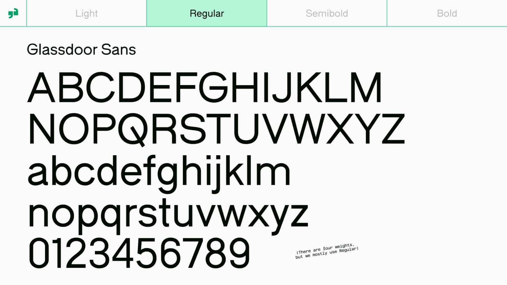
KOTO wanted to introduce a new typographic system, led by a customised typeface. Collaborating with KOTO’s LA studio, we teamed up with London-based type designer Giulia Boggio to produce a bespoke modification of their charming grotesque sans-serif Fabio XM.
This involved the creation of customised glyphs, contextual character sets and four additional font weights for both display and text purposes.
Importantly, this includes a fresh and gutsy uppercase treatment for the brand’s new wordmark, brought to life with a door-swing animation — reflective of the company’s name.
Paired with charming illustrations by Josep Puy, and a vibrant new colour palette, Glassdoor Sans is the perfect typeface to amplify Glassdoor’s commitment to creating a healthier, happier, and more transparent workplace community.