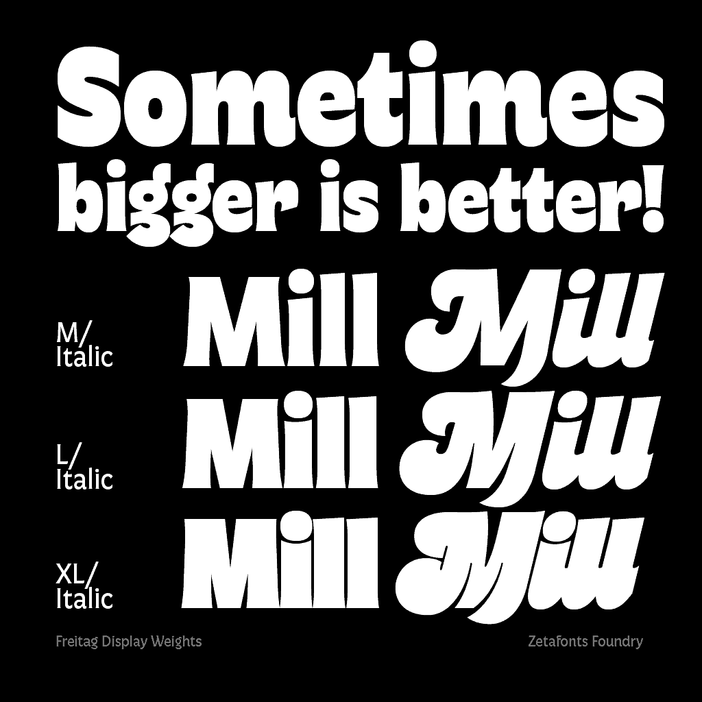
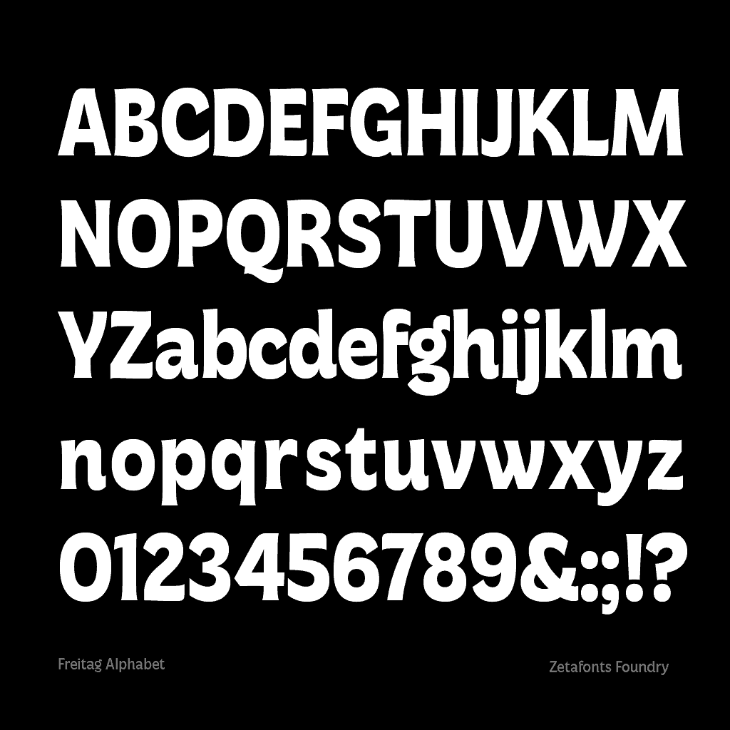
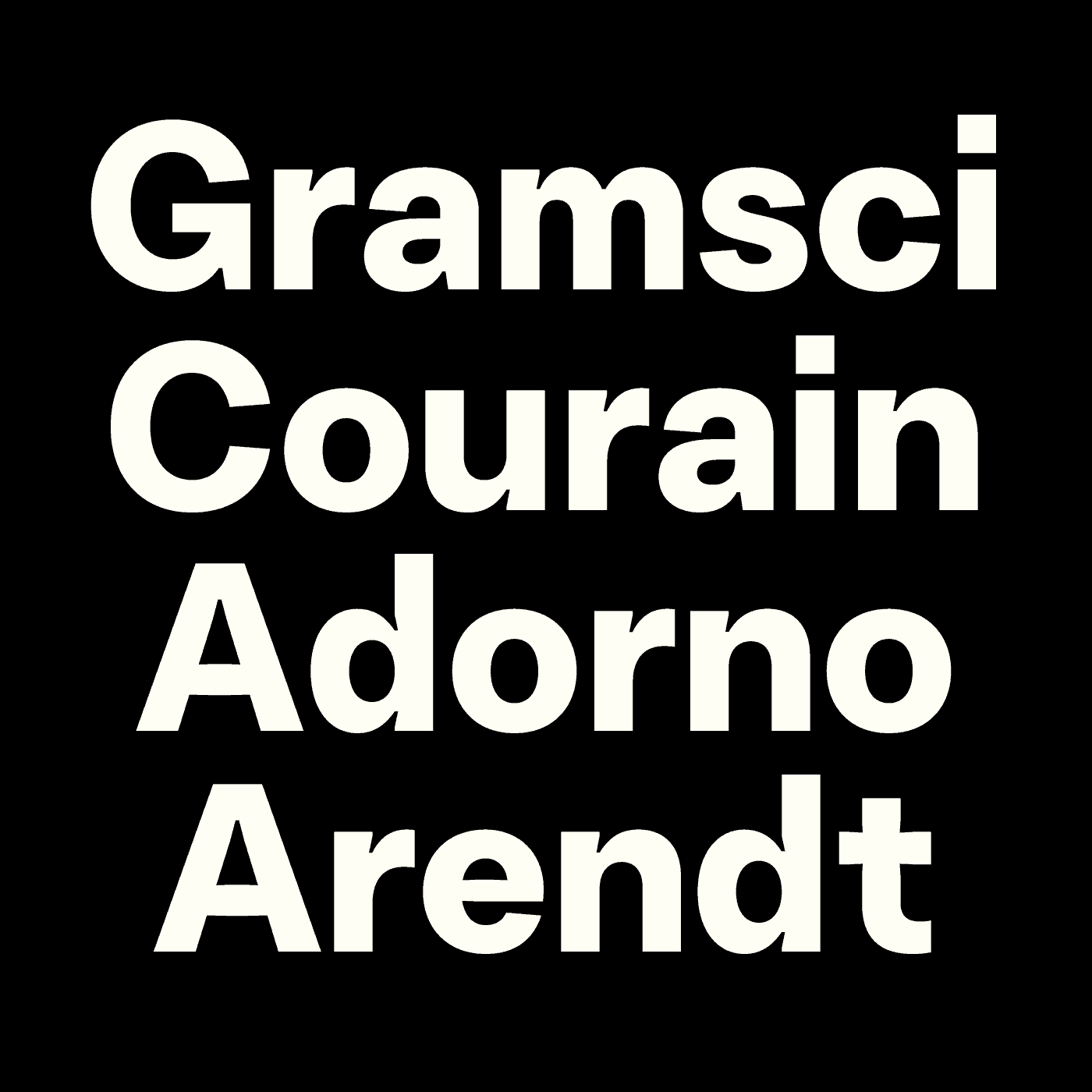
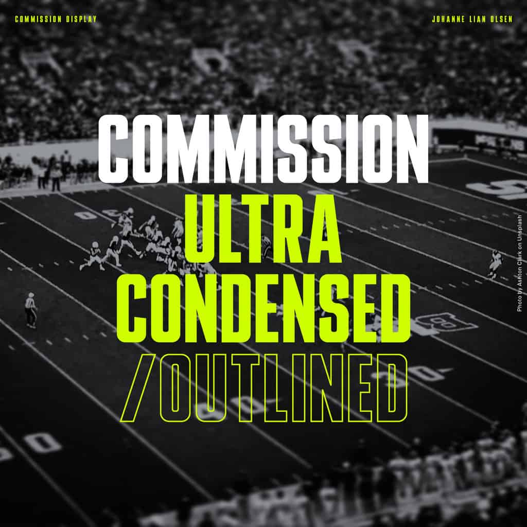
Freitag is Cosimo Lorenzo Pancini’s homage to this era and its typography. His starting point was the design of a heavy sans serif with humanist condensed proportions, flared stems, and reverse contrast, that generated both the main font family and a variant display subfamily.
Freitag’s Light and Medium weights are where the typeface shows a more controlled, medium-contrast design, tightly spaced for a maximum display effect. The Book weight follows the same design but uses a more relaxed letter spacing to allow usage in smaller sizes and short body copy. As weight increases in the Bolder weight, the style becomes more expressive, with a visible reverse contrast building up and culminating in the heavy weight with his clearly visible “bell bottoms” feel.
The display sub-family offers variant letterforms that have a stronger connection to calligraphy and lettering. Also, this style becomes an optically optimized one, as bringing the contrast and the boldness to the extreme creates smaller counter spaces that require bigger usage sizes. Lastly, the connected italics that sport swash capitals and cursive letterforms, were developed with logo design and ultra-expressive editorial design in mind. To balance the extreme contrast in the XL weight, contrast of punctuation is reduced, creating a rich, highly-dynamic texture wherever diacritics and marks are used in the text.
FEATURES:
— Total glyph set: 587
— 16 weight cuts
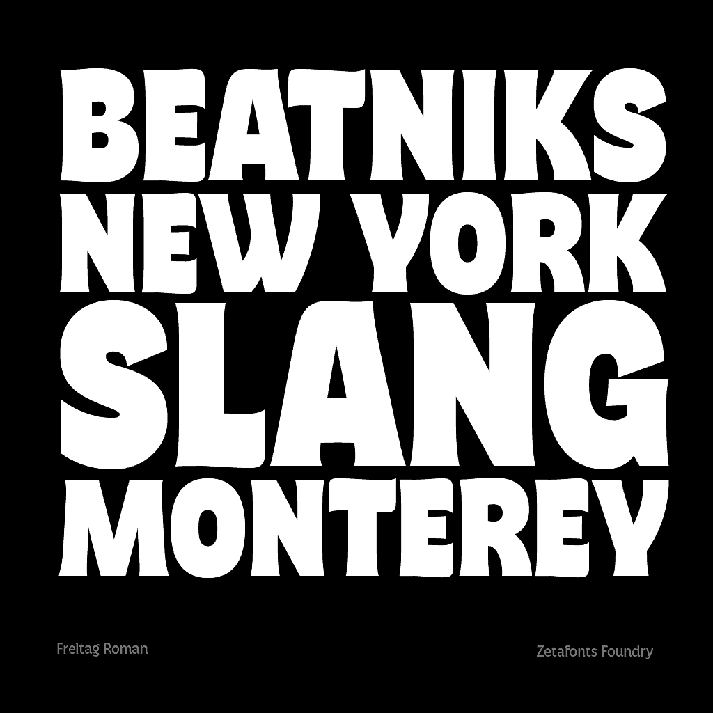
— Uppercase
— Lowercase
— Extended Latin language support
— Case-sensitive forms
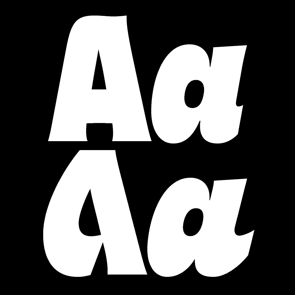
— Single & double story variants
— Stylistic alternates
DOWNLOAD FREE TRIAL.
For trial licensing information, please go to our licensing page to understand the terms of use.
Unsure about what license you need? Download our useful licensing checklist to see what each license allows you to do.