Client: Counter-Print Books
Year: 2022
Design: CounterPrint
Font in use: Quench Variable
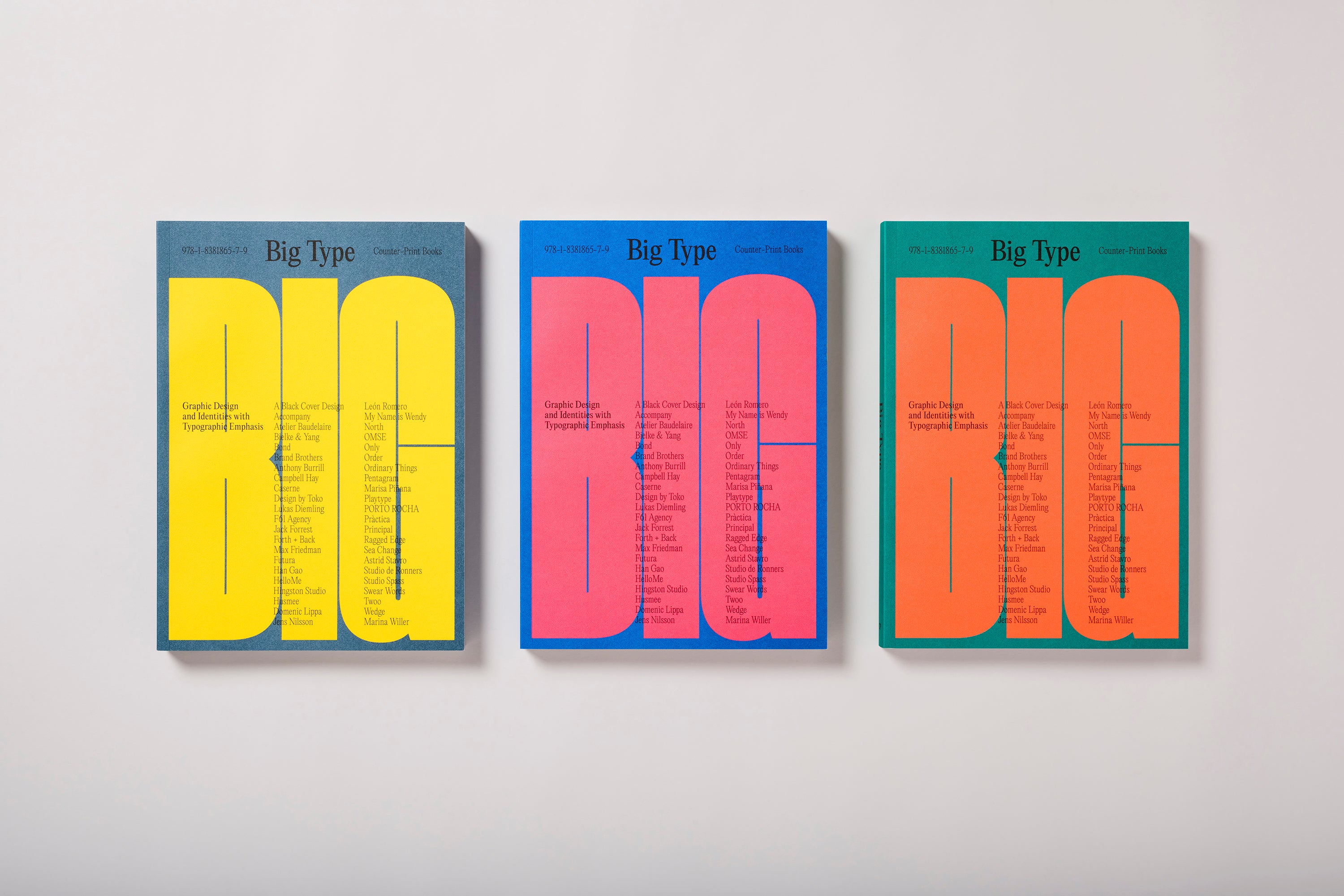
Counter-Print‘s latest book explores graphic design and identity work where typography takes the lead, documenting a moment in our design culture.
These are the conditions that form the premise for Big Type. Across the stunning pages of this book, the creativity on show examines how designers can produce work that stands out from the rest. Featuring a vast range of visuals by some of the most talented designers around, alongside a nourishing dose of illuminating interviews and enlightening project descriptions, Big Type opens its readers up to typography’s role in driving current visual cultures forward.
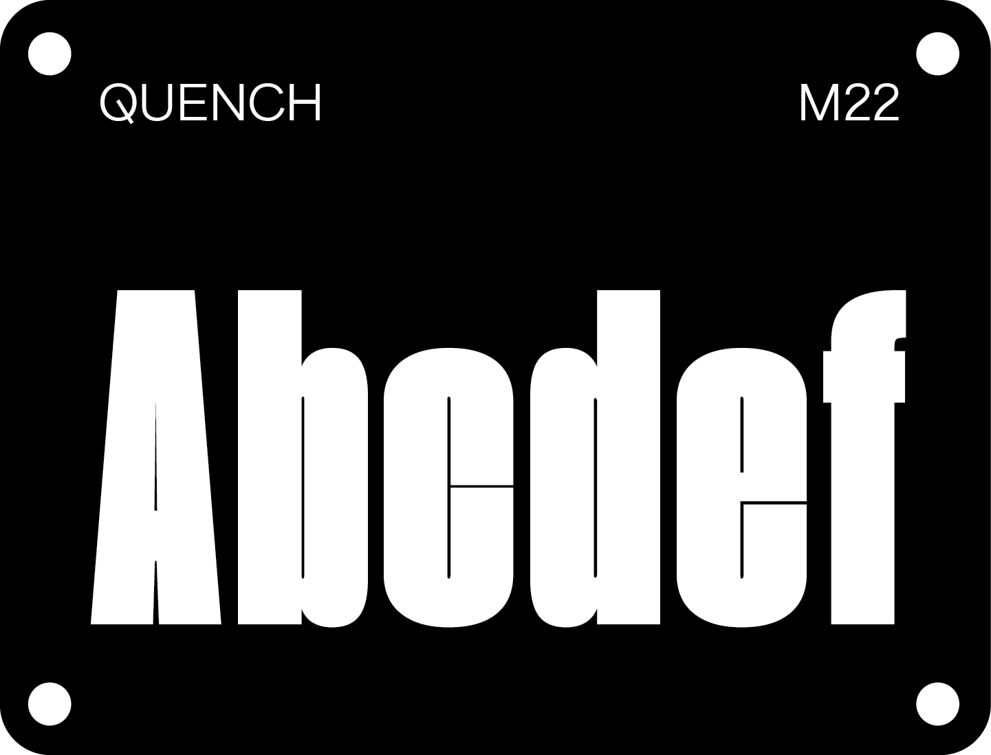
In the spirit of ‘Big Type’ the cover features Quench by Wayne Fearnley (M22 Type Foundry). Quench is a heavily condensed display typeface with tight counters and character spacing. With its playful, distinct aesthetic, Quench draws in maximum attention and is great fun to play around with when you’re looking to make a bold typographic statement– it’s no wonder it was chosen for the bold and brazen cover.


