

Daniel Stuhlpfarrer
Kritik
Aa
AA
TT
100PT
A
A


Originally conceived for an architecture magazine, Kritik has evolved into a versatile typeface that embodies the intersection of sharp critique and constructive dialogue. The design juxtaposes angular characters with rounded, soft forms, mirroring the process of enhancing an existing structure—much like adding elements to a scaffold in architectural construction.
Derived from the German word “Kritik,” meaning criticism, this typeface captures the dual nature of critique: sometimes harsh and destructive, yet also constructive and refined. In Kritik, these contrasting elements converge to form a cohesive type family featuring 7 weights: Light, Regular, Medium, SemiBold, Bold, ExtraBold, and Black.
Each weight of Kritik is meticulously crafted to maintain readability and visual impact across various applications. Whether used in editorial design, branding, or architectural publications, Kritik stands out for its ability to convey both precision and expressive depth.
- - - - - - - - - - - - - - - - - - - - - - - - -
Need help determining what license you need? Head to our licensing page for more details, or download our free font licensing guide below to help you make the correct choice.
- Total glyph set: 420
- Uppercase & lowercase
- Numbers
- Old-style figures
- Diacritics
- Standard ligatures
- Optional ligatures
- Alternates
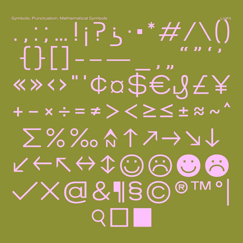
- Symbols
- Punctuation
- Mathematical symbols


FONTS IN USE

We love to see our fonts in the wild. Hit the submit button to send in your projects for a potential feature.

